Information Architecture & User Experience
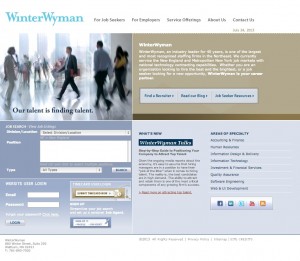
For this project, I was contributing work as a User Experience Analyst and Architect, tasked with reviewing the Google Analytics of the site and using this information, combined with best practices, to pitch new interface ideas. Analysis of the data showed that most users were strictly looking for jobs and the employer section saw very little activity.
The appearance of the site lacked visual priority and users, no matter their type, couldn’t figure out what to do with themselves as far as we could tell.
Recommendations:
- Add visual priority to the site to (1) help the users self-identify and
(2) figure out what they need from the site - Update the interface with a more mobile friendly look and feel
- Simplify content and messages
- Make room for popular blog and news features
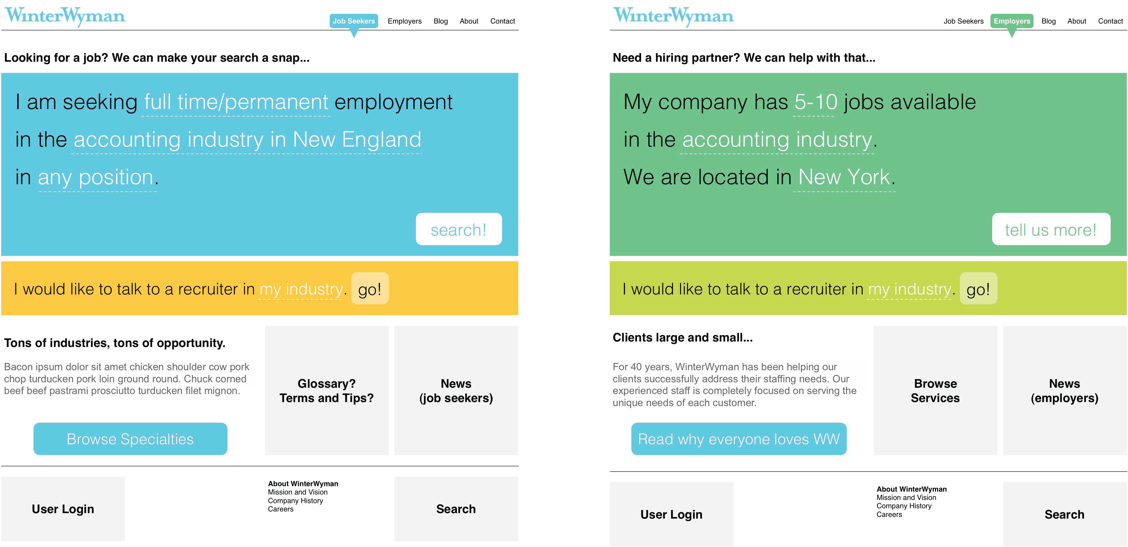
Wireframes:
To help the client visualize our intent, I put together wireframes for both types of users (job-seekers and employers looking to hire), along with documentation of our rationale for recommended adjustments.
Site Launch
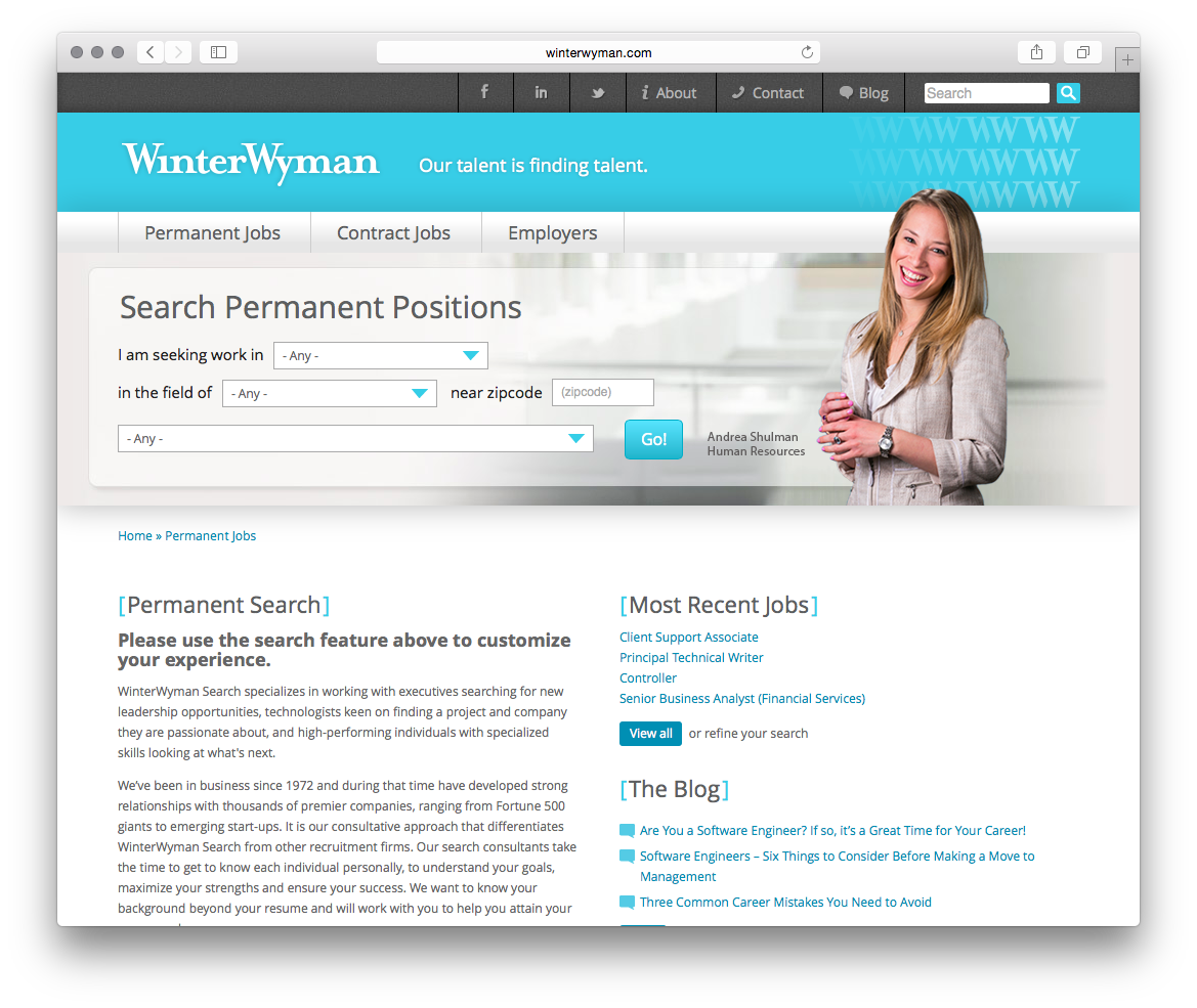
The site relaunched with a modern, clean look and feel. User-targeted navigation gained even more priority via several rounds of interface adjustments, and additional interface elements were brought to positions of priority (e.g., social buttons). Design scheme was lightened tremendously and paired with the stellar photography of the industry professionals that make up this organization.
Agency: The Atom Group