Process Mapping
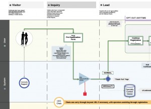 Flow Diagrams! If there’s anything in this world that can get out of control faster than a flow diagram, I don’t know what it is. That said, there is just about no better way to go about mapping out a process that involves lots of different users, agents, and systems than something involving swimlanes, decision points, and yes/no possibilities.
This project for the National Guard was ongoing and developed out of a need to understand all the ways in which users and systems acted on the overall recruitment process. This diagram was updated regularly, printed (and reprinted when needed), and hung on the wall in the offices so anyone could see the “current state” of the process. This allowed anyone on the team to review the steps in the process, and, if a better way was discovered, the process was updated in the code and the diagram was tweaked to reflect it.
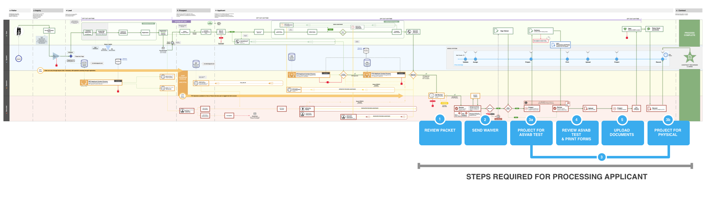
Last check, the diagram was three feet high by 16 feet long. The office really got its money’s worth out of that HP Z5200 (I was rather fond of it). This particular diagram, was created by a talented member of the team I managed (not by me). However, it was my responsibility to regularly review it, determine when updates were required, and “fact check” the documentation therein. Does this process still work this way? If no, let’s get it updated. If yes, should it stay that way? Really? Lots of fun.
Agency: iostudio