Website Design & Maintenance: NationalGuard.com
I worked on this website for literally years. At the start, I served as a designer and frontend programmer. When my watch ended, I was responsible for the team that reported on how well the site was performing. I include these images here to display how far the site has come and the breadth of changes that took place.
2006-ish
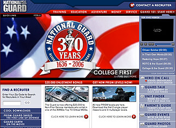 When I started with the company working on the site, the National Guard recruiting brand had a very specific look at feel. It was very blue and there were a lot of cooks in the kitchen vying for prime real estate on the front page. The iteration here (my apologies for the pixelation, I think I had to fight with a very cranky old thumb drive to source it) was actually not the first I worked on but the second. It featured a self-selection engine designed to help users find their way to content that was tailored for them. In an era well before tablets and smartphones, it worked pretty well: we had lots of screen real estate to play with and we knew that the main reason for the site (joining the National Guard) had to always be the most important, most visible thing on every page (which it was).
2007-ish
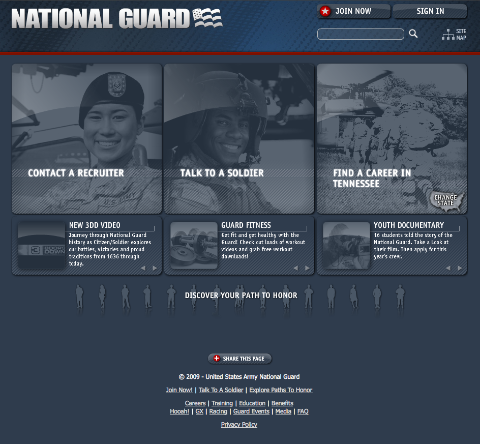 In the next cycle, we won a user experience battle to shift the focus of the home page away from the over-busy, interface to a more minimal design with fewer options that emphasized what we knew (based on user behavior and data!) users were really looking for: they wanted to join the Guard, they wanted to talk to someone already in the Guard, or they wanted to figure out what the Guard was about in their home state. Real estate for promotions was maintained but in a much subtler way and the tiles columns were each focused on a subject and were randomized. The user self-identification work and content was still important, too, and it was made a little more prominent with the tiny silhouettes along the bottom.
2009-ish
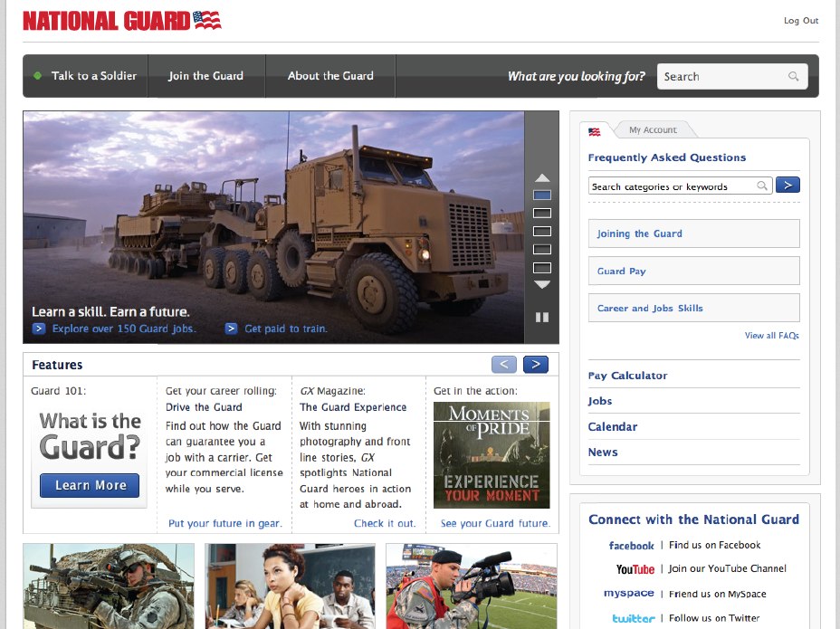 Big things were happening in the design world: the Apple-esque look-and-feel was all the rage and a lighter, brighter era of websites was beginning. The Guard site followed suit with another iteration that followed this trend and reverted a bit to a homepage that smacked of the busy days of yore. This version, however, had visual priority and finesse that no previous version of the site had ever had. It still promoted the top three reasons people came to the site but, through its content, it sought to tell the story of the Guard more completely. It also added a few fun web toys (e.g., Pay Calculators) that made the information on the site more relevant.
2012-ish
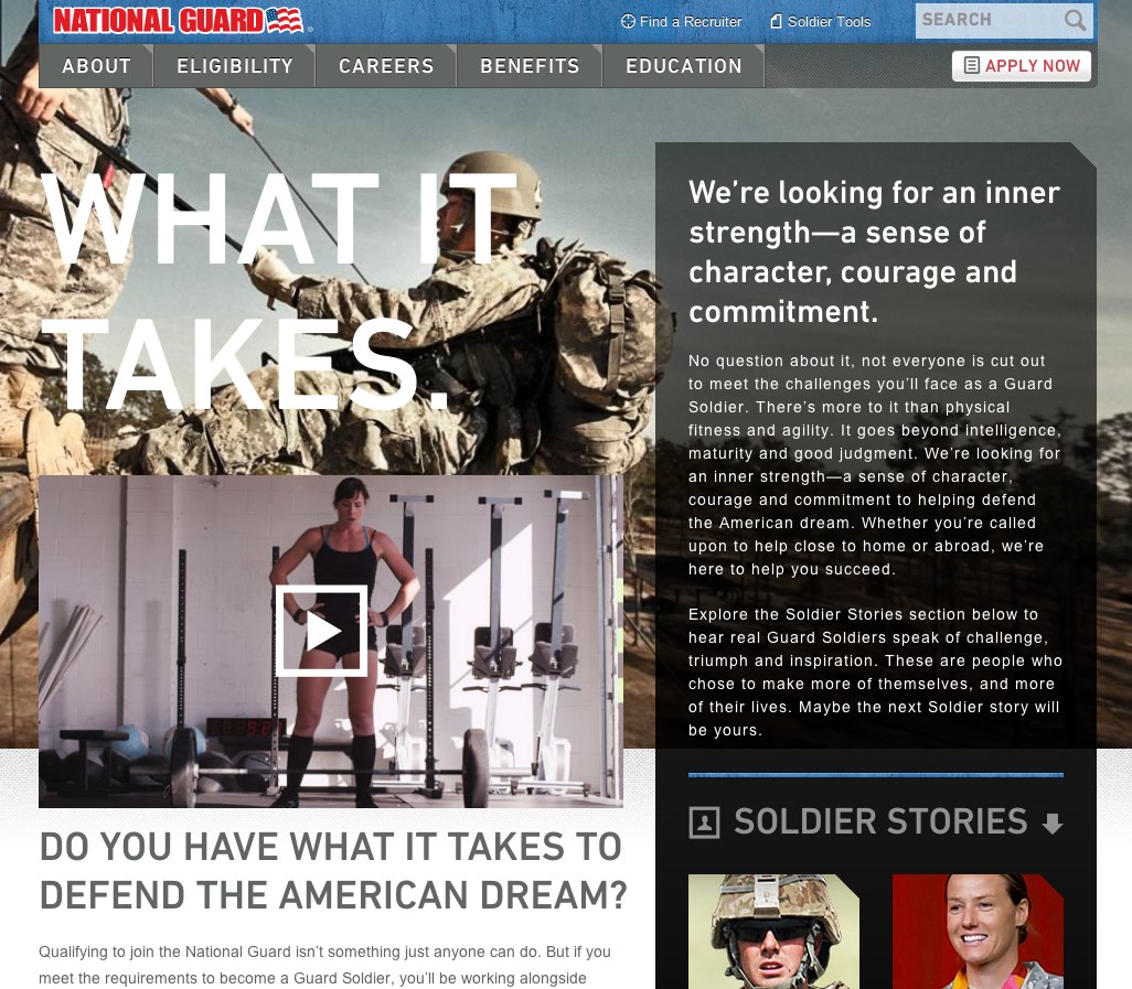 The structure and content of last version of the site that I worked on was developed based almost completely on user behavior information and the experience of the talented team. Everything on the previous version had been tagged to death in Google Analytics so we knew exactly how to hit the high points. Furthermore, we had excellent access to the target audience and great synchrony with the client on messaging. This site was also completely adaptive and mobile-friendly: after all, none of the previous versions had to contend with iPads! This site also made use of a plethora of beautiful videos for the TL;DR generation of new potential recruits.
Agency: iostudio